UX Research Methods·25 min read·March 16, 2026
Beyond Nielsen’s 10: Usability Heuristics for the AI Era
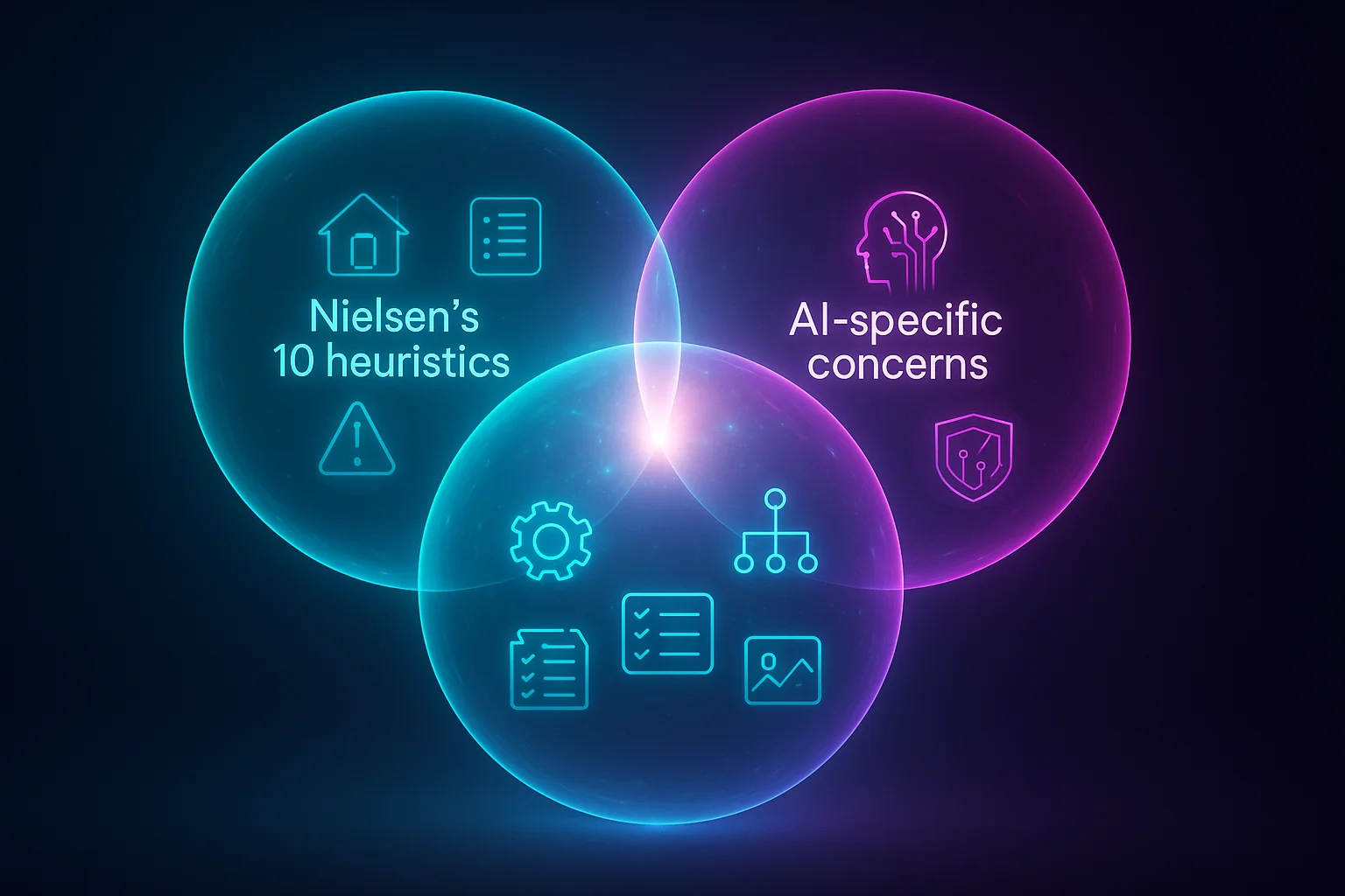
Nielsen’s heuristics were built for buttons and menus. AI products need heuristics for trust calibration, graceful error recovery, and the strange new problem of systems that are confidently wrong. Here are eight principles to evaluate what the original ten cannot.
Viktor BezdekEngineering / Product Leadership
In 1994, Jakob Nielsen distilled decades of usability research into ten heuristics that became the universal evaluation framework for software interfaces. Visibility of system status. Match between system and real world. User control and freedom. Consistency and standards. Error prevention. Recognition rather than recall. Flexibility and efficiency of use. Aesthetic and minimalist design. Help users recognize, diagnose, and recover from errors. Help and documentation. For thirty years, these ten principles have been the first tool UX teams reach for when evaluating an interface. They work. They are timeless in the way they capture fundamental human needs for control, clarity, and predictability.
And they are not enough for AI.
Nielsen's heuristics assume a deterministic system — one that behaves the same way given the same input, that either works or displays a clear error, that the user controls through direct manipulation. AI products violate all three assumptions. They produce different outputs from the same input. They can produce fluent, confident responses that are wrong without any error signal. And the user's relationship to the system is not control but collaboration — or sometimes delegation. Running a standard heuristic evaluation on an AI product is like using a building inspection checklist on a boat. The fundamentals of structural integrity still apply, but you are missing everything that matters about being on water.
Why We Need New Heuristics, Not Updated Old Ones
Some practitioners have tried to stretch Nielsen's existing heuristics to cover AI. They reinterpret 'visibility of system status' to include AI confidence display, or expand 'error prevention' to include hallucination mitigation. This approach fails because it obscures the fundamentally new challenges AI introduces. Confidence display is not a subcategory of system status — it is a distinct design dimension with its own principles, failure modes, and patterns. Hallucination mitigation is not error prevention — it is a new kind of challenge where the system does not know it is wrong and therefore cannot prevent the error in the traditional sense.
What follows are eight AI-specific usability heuristics. They are designed to complement Nielsen's ten, not replace them. Apply the original ten first — they still catch genuine usability problems. Then apply these eight to evaluate the AI-specific dimensions that the originals miss.
Heuristic 1: Appropriate Trust Calibration
The interface should help users develop an accurate mental model of when to trust the AI and when to verify independently. Users should neither over-rely on the AI (accepting everything uncritically) nor under-rely on it (ignoring useful outputs out of blanket skepticism).
Violation Example
A legal research AI presents all findings with the same visual treatment and confidence language regardless of whether the cited case law is verified, partially matched, or speculatively inferred. Users cannot distinguish a solid finding from an AI extrapolation. Over time, a lawyer either trusts everything (dangerous) or trusts nothing (wasteful).
Compliance Example
Perplexity visually distinguishes claims backed by cited sources from unsourced assertions. Cited claims include inline source links. The visual hierarchy communicates that sourced content is more reliable than unsourced content without requiring the user to check every link. Users develop calibrated trust: they accept sourced claims more readily and scrutinize unsourced ones.
Heuristic 2: Uncertainty Transparency
When the AI is uncertain, the interface should communicate this proportionally and actionably. Users should be able to distinguish between high-confidence and low-confidence outputs without needing to understand probability scores.
Violation Example
A medical symptom checker presents its top diagnosis with the same formatting and language whether the model's confidence is 95 percent or 40 percent. A patient reads 'You may have condition X' identically in both cases, with no way to assess whether this is a near-certain match or a tentative guess.
Compliance Example
A code review AI uses visual tiers: definite bugs are marked in red with direct language ('This will cause a null pointer exception'), likely issues in amber with hedged language ('This pattern often leads to race conditions in concurrent contexts'), and style suggestions in gray with optional language ('Consider renaming for clarity'). The user immediately sees the confidence gradient without reading a number.

Heuristic 3: Recoverability From AI Errors
Users should be able to easily detect, understand, and reverse AI errors at any point in the interaction. The cost of an AI mistake should be proportional to the effort required to fix it.
Violation Example
An AI email assistant sends a reply on the user's behalf with no preview step and no undo window. The AI misinterpreted the user's intent, sent an inappropriate response, and the user discovers the error only when the recipient responds with confusion. The error is irrecoverable.
Compliance Example
Gmail's Smart Compose suggests text inline but requires the user to explicitly accept each suggestion with Tab. If the suggestion is wrong, the user simply keeps typing and the suggestion disappears. The recovery cost is zero because acceptance is always an explicit, reversible action.
Heuristic 4: Explanation Adequacy
Users should be able to understand why the AI produced a specific output at a level of detail appropriate to the decision at stake. Explanations should be available on demand without cluttering the default experience.
Violation Example
A hiring platform's AI ranks candidates but provides no explanation of the ranking criteria. A recruiter cannot tell whether the AI weighted experience, skills, education, or something else. They are asked to trust a black box with a decision that affects people's livelihoods.
Compliance Example
Notion AI provides a 'show reasoning' expandable section for complex outputs. The default view shows the result. The expanded view shows the key factors the AI considered and the sources it drew from. The explanation is always available but never forced on users who just want the answer.
Heuristic 5: Predictable Inconsistency
Users should be able to build a stable mental model of the AI's behavior patterns even though individual outputs vary. The system's inconsistency should itself be predictable — users should know which types of requests produce reliable outputs and which produce variable ones.
Violation Example
A writing assistant produces wildly different outputs for the same prompt on consecutive uses. Sometimes it writes formally, sometimes casually. Sometimes it is concise, sometimes verbose. The user cannot learn when to expect formality versus casualness because the variation appears random.
Compliance Example
GitHub Copilot is more reliable for boilerplate code (imports, common patterns, test setups) and more variable for complex logic. Users learn this pattern quickly: they accept boilerplate suggestions without scrutiny and review complex suggestions carefully. The inconsistency has a predictable shape that users can internalize.

Heuristic 6: Appropriate Automation Level
The degree of AI automation should match the user's comfort, the task's risk level, and the AI's reliability for that specific task type. Users should be able to adjust the automation level.
Violation Example
A calendar AI automatically schedules meetings based on email analysis without asking. It books a room, sends invitations, and allocates time blocks based on its interpretation of email threads. A user discovers their afternoon is fully booked with meetings they did not intend to schedule.
Compliance Example
Linear's AI suggests issue priorities and assignments but presents them as recommendations the team lead explicitly approves. The team lead can also adjust the automation level: auto-assign for low-priority bugs, suggest-and-confirm for features, manual-only for critical issues. The automation boundary is visible and user-controlled.
Heuristic 7: Context Awareness Communication
The interface should communicate what context the AI is using to generate its response. Users should know what the AI 'knows' about them, their task, and their environment — and what it does not know.
Violation Example
A customer support AI responds to a user's question without indicating whether it has access to their account history, recent tickets, or product usage data. The user does not know if the AI is providing personalized advice or generic suggestions, which changes how they should interpret the response.
Compliance Example
Claude shows a visible context indicator: the files, documents, or conversation history currently in context. Users can see exactly what information the AI is working with and add or remove context as needed. This makes the AI's knowledge state transparent and user-controllable.
Heuristic 8: Graceful Capability Boundaries
The system should clearly communicate the boundaries of what the AI can and cannot do, and handle requests near those boundaries gracefully rather than producing degraded outputs silently.
Violation Example
A translation AI handles common language pairs well but silently degrades on rare pairs. A user requesting Yoruba-to-Korean translation receives a fluent but inaccurate result with no indication that this language pair is outside the model's strong suit. The fluency masks the inaccuracy.
Compliance Example
Midjourney clearly communicates what it does well (creative imagery, artistic styles) and what it struggles with (precise text rendering, exact anatomical detail). When a prompt pushes into a known weakness area, it can flag this: 'Text in images may not be accurate — consider adding text in post-processing.' The capability boundary is communicated before the user invests effort evaluating a flawed output.
Using the Heuristics: A Practical Evaluation Protocol
Here is how to run a heuristic evaluation using all 18 principles — Nielsen's 10 plus these 8. The process is similar to a traditional heuristic evaluation but with additional attention to the AI-specific dimensions.
- Assemble 3-5 evaluators with a mix of UX expertise, AI product experience, and domain knowledge
- Define 5-8 representative user tasks that exercise the AI features, including at least one task where the AI is likely to produce a suboptimal output
- Each evaluator independently walks through all tasks, scoring each of the 18 heuristics on a severity scale (0 = no issue, 4 = usability catastrophe)
- Pay special attention to heuristics 1 (Trust Calibration) and 3 (Recoverability) — these are where the most severe AI usability failures cluster
- In the debrief, aggregate findings by heuristic and by severity. AI-specific heuristic violations are often rated less severe by evaluators unfamiliar with AI failure modes — calibrate by asking: what happens when this AI output is wrong?
- Prioritize fixes by combining severity with frequency: a moderate trust calibration issue that affects every interaction outweighs a severe capability boundary issue that affects rare edge cases
Running a standard heuristic evaluation on an AI product is like using a building inspection checklist on a boat. The fundamentals of structural integrity still apply, but you are missing everything that matters about being on water.
From Framework to Culture
Heuristics are most powerful not as an evaluation tool but as a design vocabulary. When a team has shared language for the specific ways AI interfaces can fail, they catch failures earlier. A designer who has internalized 'appropriate trust calibration' notices when a mockup presents all AI outputs with equal visual weight. An engineer who understands 'recoverability from AI errors' builds undo mechanisms before they are requested. A product manager who grasps 'graceful capability boundaries' writes requirements that include failure mode specifications alongside happy path specifications.
Nielsen's heuristics became powerful not because they were published in a journal but because they became part of how teams talk about design. These eight AI heuristics will serve the same function if they become part of your team's design review vocabulary. Print them. Pin them next to the whiteboard. Reference them in code reviews. Cite them in design critiques. The goal is not to check a box. It is to build a shared sensitivity to the ways AI products can fail their users — and to catch those failures before users encounter them.
Nielsen's heuristics became powerful because they became part of how teams talk about design. These AI heuristics will serve the same function — if you make them part of your design review vocabulary.
Key Takeaways
- Nielsen's 10 heuristics remain essential but were designed for deterministic, direct-manipulation interfaces — they miss critical AI-specific failure modes
- Eight complementary AI heuristics: Trust Calibration, Uncertainty Transparency, Recoverability From AI Errors, Explanation Adequacy, Predictable Inconsistency, Appropriate Automation Level, Context Awareness Communication, and Graceful Capability Boundaries
- Each heuristic has concrete violation and compliance examples drawn from shipping AI products
- The 'wrong output test' — deliberately triggering AI errors and evaluating the UX response — exercises five heuristics simultaneously and reveals true AI UX robustness
- Heuristics are most powerful as shared design vocabulary, not just evaluation checklists — integrate them into design reviews, code reviews, and product requirements
Thirty years ago, Nielsen gave us a language for talking about usability. That language transformed how teams build software. The AI era needs its own language — not to replace the original, but to extend it into territory Nielsen could not have anticipated. These eight heuristics are a starting point. They will evolve as AI products mature, as failure patterns emerge, and as the field develops deeper understanding of what makes AI experiences genuinely usable. What will not change is the need for structured, principled evaluation of interfaces that increasingly shape how people make decisions, access information, and navigate their lives. The stakes are too high for intuition alone.
Usability HeuristicsAI EvaluationNielsenUX ResearchAI UXDesign Framework
KEEP READING
Related Articles
AI UX Patterns·22 min read
Designing for Uncertainty: UX Patterns When AI Outputs Are Probabilistic
Traditional interfaces promise deterministic results. AI interfaces cannot. The gap between what users expect and what probabilistic systems deliver is where trust lives or dies — and most teams are designing for the wrong side of it.
AI UX Engineering·20 min read
Graceful Degradation: Designing AI Features That Fail Without Breaking Trust
Every AI feature will fail. Models hallucinate, services crash, confidence drops below usable thresholds. The question is never whether your AI will fail — it is whether users will still trust your product afterward. That depends entirely on how you design the failure.